From the coal-black stripes of yesteryears to the modern-day marvels, this is the tale of the famous black and white that’s been worn with pride by Geordies through thick and thin.
The Birth of the Stripes (1892-1900)
Our story begins way back in 1892, when Newcastle East End and Newcastle West End decided to put their differences aside and form what we now know as Newcastle United. At first, the kit wasn’t the black and white stripes we love today. Believe it or not, the lads originally played in red shirts and white shorts - but only for a couple of years.
Come 1894, the club decided to don the now-iconic black and white stripes. Some say it was inspired by the colors of the coal mines that were the lifeblood of the city. Others reckon it was to make the players look slimmer. Either way, it’s been black and white ever since, and thank the football gods for that, eh?
The Early Years (1900-1940)
The early years of the 20th century were a golden age for Newcastle United, and the kits of this era set the tone. The shirts were simple - black and white stripes with a classic collar and lace-up neck, proper old school, but became synonymous with success.
In 1908, Newcastle won their third league title in just five years, and the kits became the stuff of legend as the likes of Colin Veitch and Bill Appleyard strutted their stuff in those stripes, bringing glory to St. James' Park.
The 1920s, though, saw the introduction of a few different styles. The stripes remained, but the collar designs and lace-up fronts changed more times than yer grandma's curtains. But despite the occasion alteration, the success kept coming - including the 1924 FA Cup final, where the Toon lifted more silverware wearing those iconic black and white shirts. Ah, what a time to be alive!
Wartime and Post-War Era (1940-1960)
The Second World War put a halt to football, but when the beautiful game resumed, so did the evolution of the Newcastle kit. The shirts of the 1940s and 50s stayed true to the black and white tradition but began to look a bit more modern.
In the 1950s, we saw the introduction of the v-neck, a move away from the lace-up collars of the past. This was the era of Jackie Milburn, Bobby Mitchell, and the great FA Cup triumphs of 1951, 1952, and 1955. These kits were iconic, not just for the design but for the legends who wore them.
The Swinging Sixties (1960-1970)
The 1960s were a time of change, and not just in fashion. Newcastle's kits saw a bit of a revamp, too. The stripes remained, but the design became a bit bolder. The shirts were now made of a lighter material, making the players a bit more comfortable on the pitch - albeit still a far cry from the state-of-the-art breathable materials used today.
One of the most notable changes came in 1969 when Newcastle United won the Inter-Cities Fairs Cup. The kit for that European campaign was a classic, featuring the traditional black and white stripes with a round neck; simple but effective, just like the team.
The 70s and 80s: Experimentation and Innovation
The 1970s brought about some bold changes. The stripes were often wider, and the following decade continued this trend of experimentation.
The Eighties saw the introduction of the club sponsor, with Newcastle Brown Ale becoming the first name to grace the front of the shirt in 1980, along with the blue star which was to become so embedded in the fabric of the club over the next few years.
The Entertainers (1990-2000)
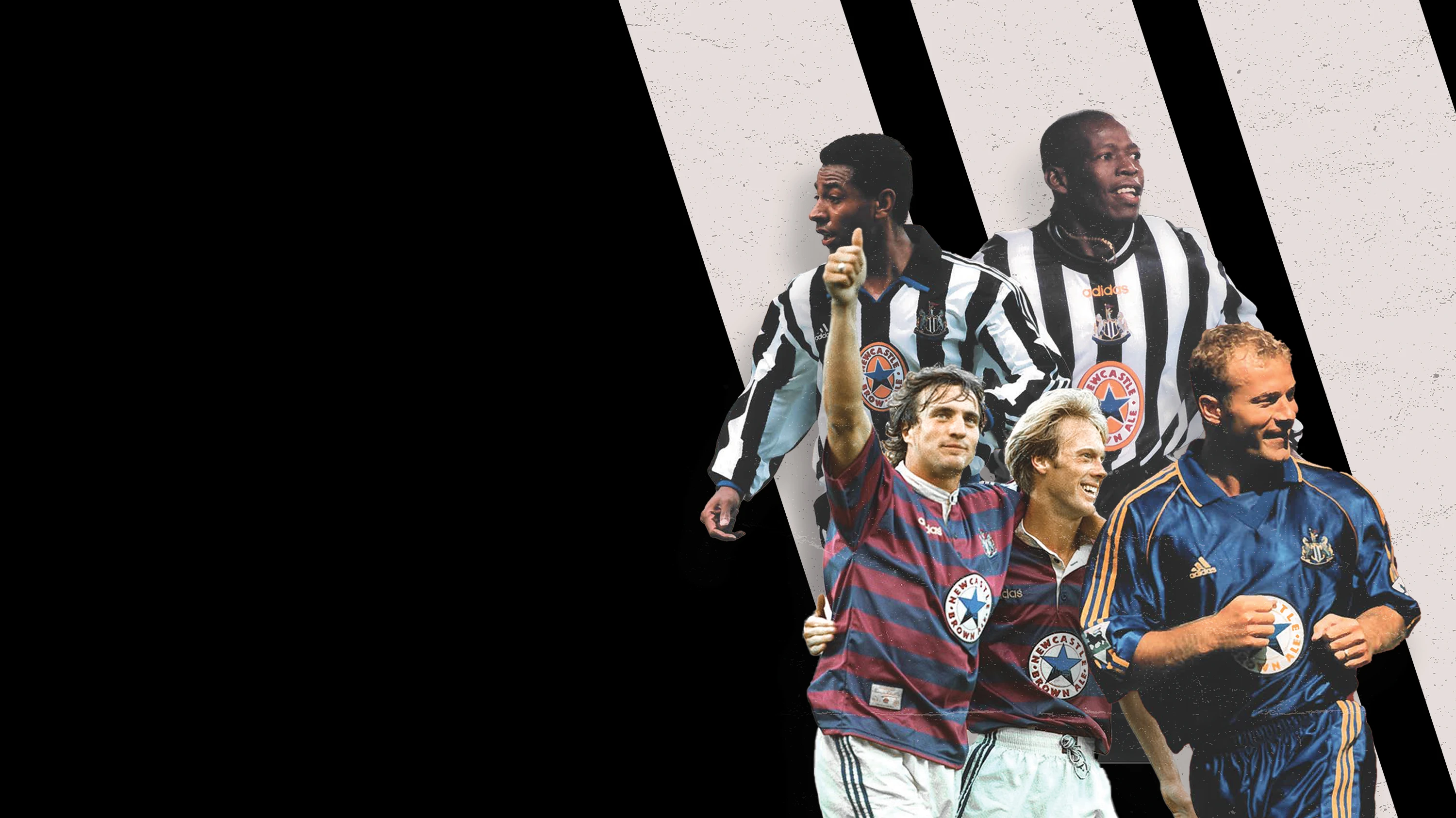
Ah, the 90s. What a time to be a Newcastle fan. The club was flying high under Kevin Keegan, and the kits were some of the most memorable in the club's history. Who can forget the iconic adidas shirts with the grandad collar from the mid-90s? Those shirts are etched in the memories of fans, synonymous with the likes of Alan Shearer, David Ginola and Peter Beardsley.
One of the most beloved kits was the 1995-97 home shirt. The broad stripes, the collar, the Newcastle Brown Ale sponsor - it was perfect. It's no wonder you still see loads of fans wearing them at. St. James' Park to this day.
The New Millennium (2000-2010)
The turn of the millennium saw Newcastle continuing to innovate with their kit designs. The early 2000s saw the introduction of the all-black away kit, which quickly became a fan favourite. There was something about seeing the lads in all black that struck fear into the hearts of opponents.
The designs during this era retained that classic Newcastle feel. The black and white stripes were always there, though the width and style of the stripes varied.
And with Sir Bobby Robson's team playing flamboyant, attacking football and qualifying for the Champions League, the shirts from this period are fondly remembered.
Recent Times (2010-Present)
In recent years, Newcastle United's kits have continued to evolve. Puma took over as the kit manufacturer in 2010, bringing a new era of sleek, modern designs. The 2010-11 home kit was a nod to the past, featuring broad black and white stripes and a simple collar.
One of the standout kits in recent memory is the 2017-18 home shirt, celebrating the club's 125th anniversary. The design was a perfect blend of old and new, with thin black and white stripes and gold detailing to mark the special occasion.
In 2021, the club announced a new partnership with Castore, a relatively new player in the sportswear market. Those kits brought a fresh look to the club while respecting the traditions of the black and white stripes - with the 21-22 kit including a grandad collar in a nod to the '90s.
The Away Kits: A Splash of Colour
While the home kits have remained steadfastly black and white, the away kits have been a canvas for creativity. Over the years, we've seen a rainbow of colours - from the classic 1995-96 away kit to the vibrant orange of the 2018-19 third kit.
One of the most iconic away kits has to be the maroon and navy blue hoops worn during the 1995-96 season. It was bold, different, and became an instant classic. Another memorable away kit was the all-grey kit from the '80s which was donned by the likes of Chris Waddle, Peter Beardsley and Paul Gascoigne.
The Third Kits: The Wild Cards
Third kits are where designers really get to have fun, and Newcastle's third kits have often been the wild cards. From the rarely-seen green kit of the early 90s to the bright yellow kit of the late 2010s, these kits have allowed the club to step outside the traditional colour scheme.
In recent years, the third kits have been particularly eye-catching. The 2020-21 third kit, a bold purple design, was a standout. And the previous season's third kit, with its vibrant orange design and a pattern depicting the St. James' Park roof, showed that the club wasn't afraid to push the boundaries.
And there you have it, me bonny bairns - a whirlwind tour through the history of Newcastle United kits. From the simple black and white stripes of the early days to the modern designs of today, the Toon's kits have always been a symbol of pride and passion.
The black and white stripes are more than just colours; they're a way of life. They represent the heart and soul of our city, the unyielding spirit of the Geordies, and the eternal hope that one day, just maybe, we’ll see the Toon lift the Premier League trophy.
So next time you pull on that black and white shirt, remember the history, the legends, and the pride that comes with it. Howay the lads and lasses.